How to Get out of your Mid-tone Trap
Many artists work mostly in mid-tones, with few true lights or darks. If your painting feels “off” but you can’t quite figure out why, this may be the culprit. The colors might be lovely, the technique sound, the composition thoughtful, and yet the piece sits flat and a little lifeless on the wall.
What the mid-tone trap looks like
Value is simply how light or dark a color is, regardless of its hue. When most of the shapes in a painting land in the same narrow middle range, nothing has room to advance or recede. The eye has no clear place to rest and no clear place to land. The result is often a painting that reads as muddy, timid, or washed out, even when each individual color choice seems right.
It’s an easy habit to fall into. Mid-tones feel safe. A true dark can seem risky, because it’s hard to undo. A true light can feel like you’re giving up the subtle color you worked so hard to mix. So we hover in the middle, and the painting hovers with us.
Why a variety of values matters
A full range of values does a lot of quiet work in a painting:
It creates depth. Lighter and darker passages push shapes forward and back, giving even an abstract piece a sense of space.
It guides the eye. The strongest contrast in a painting naturally becomes the focal point. Without contrast, the viewer wanders.
It builds mood and drama. High contrast feels bold and energetic; a narrow range feels quiet. Both are valid, but they should be a choice rather than an accident.
It makes color sing. A saturated color looks more brilliant when it sits beside a darker or lighter neighbor. Value contrast is often what makes a color look vivid, more than the pigment itself.
It gives the painting structure. A strong value pattern holds a composition together even if the color relationships change.
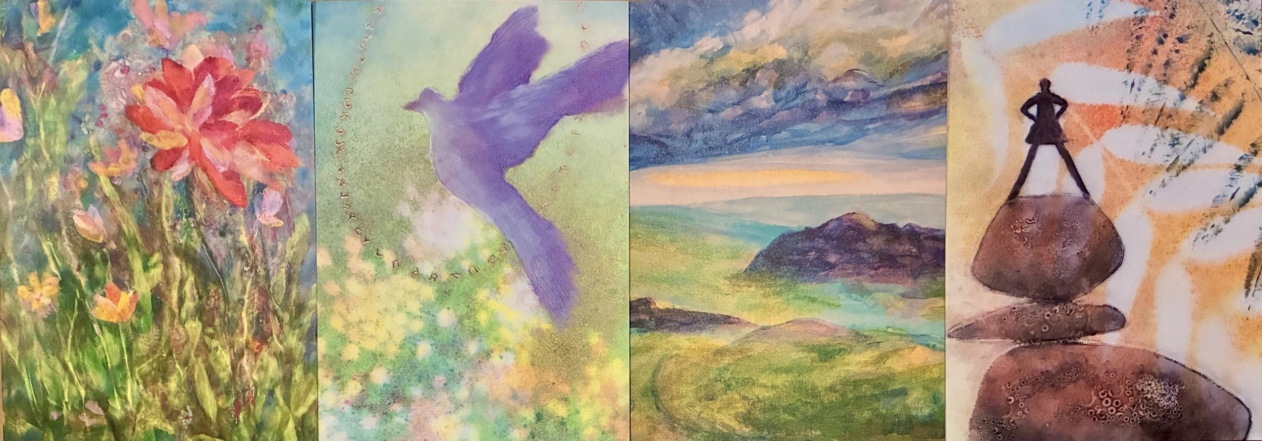
A simple test: if your painting reads clearly as a pattern of lights and darks when you squint at it or view it in black and white, it will hold up at any size and from across the room.
Learning to see value
When this comes up in my Creative Connections mentoring sessions, we focus on color values and how to better recognize them. The challenge is that color is distracting. A bright yellow and a medium blue can be nearly identical in value, but our eyes insist they’re different. Training yourself to see past hue is a skill, and like any skill it improves with practice and with the right tools.
This is especially true for encaustic. Wax paints and pigment sticks can look quite different on the palette than they do on the panel, and translucent layers shift value as they build up. A little checking along the way saves a lot of frustration later.
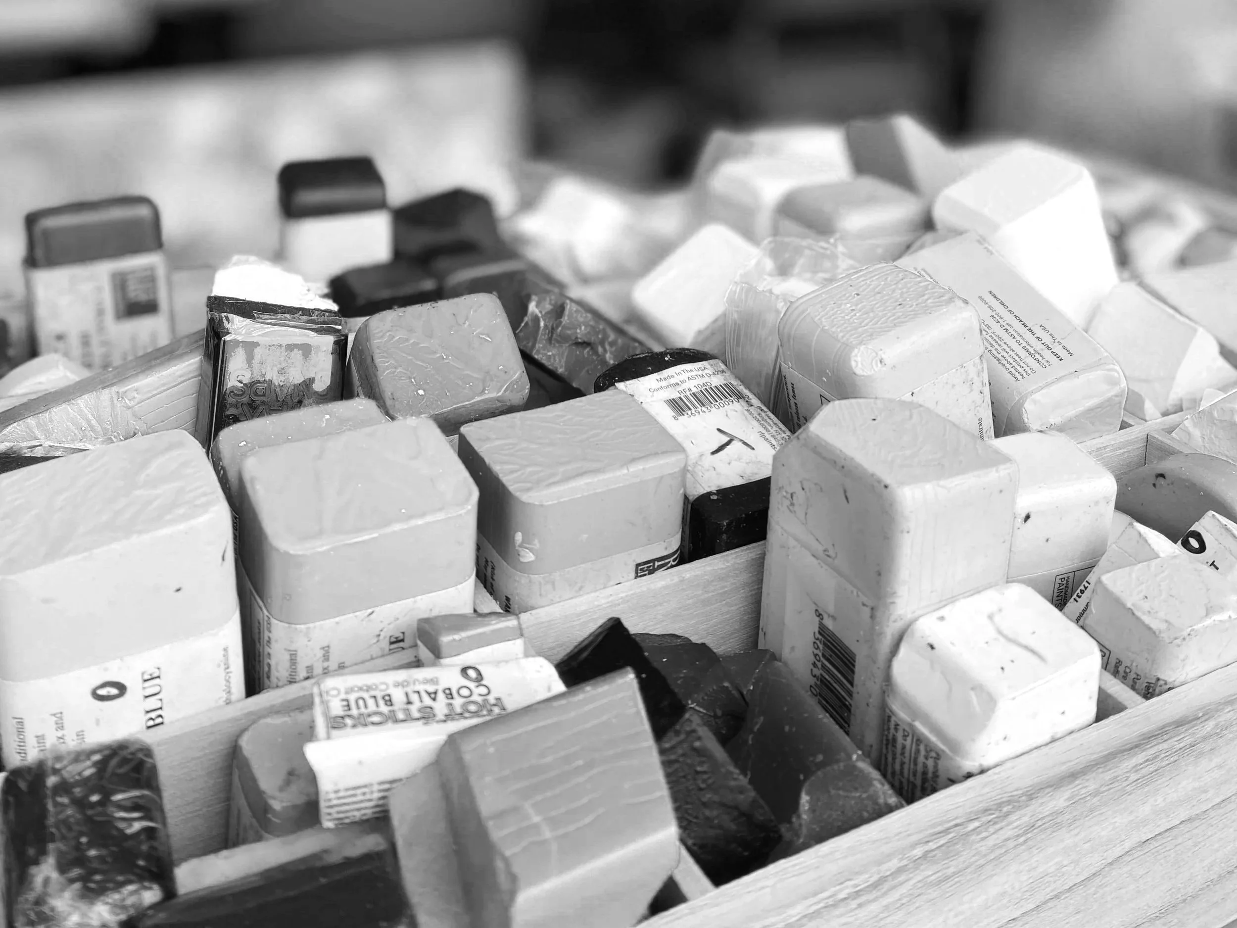
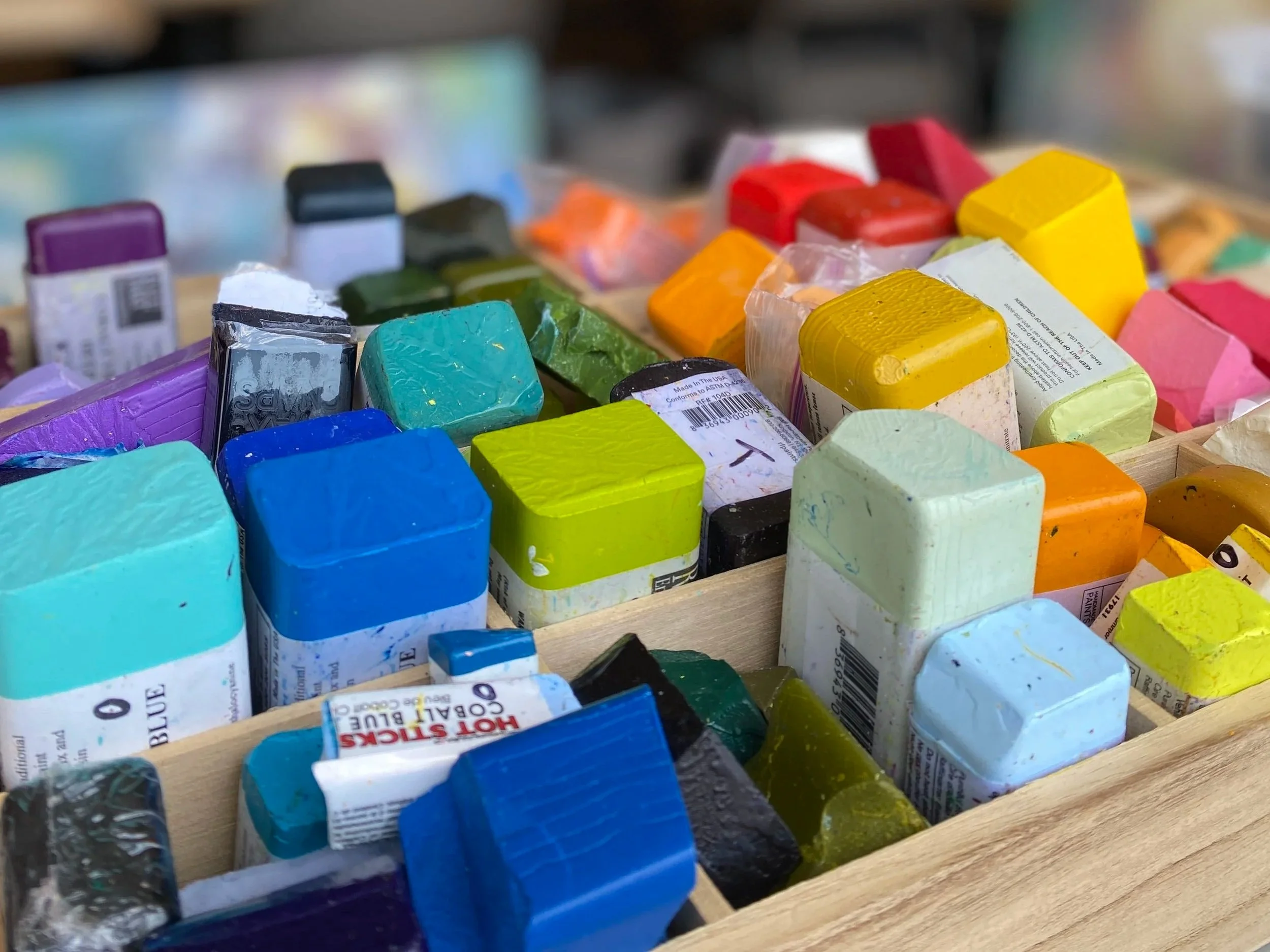
One easy place to start is the image that accompanies this article: a black and white photo of encaustic paints. Making a black and white photo of your own paints, or even a color chart, can be a handy reference when you’re choosing paint and pigment sticks. It isn’t a perfect reference, because photos and screens can shift values a little, but it will give you a place to start. Take a snapshot of your palette, convert it to grayscale, and see how many of your colors cluster together in the middle. That cluster is your mid-tone trap, made visible.
Tools to help you evaluate value
If you want to go further, here are a few evaluation tools I find helpful:
A value finder lets you hold a gray scale up against a color and see where it falls. A grid helps you check your composition and the placement of lights and darks. Used regularly, tools like these train your eye so that, over time, you need them less.
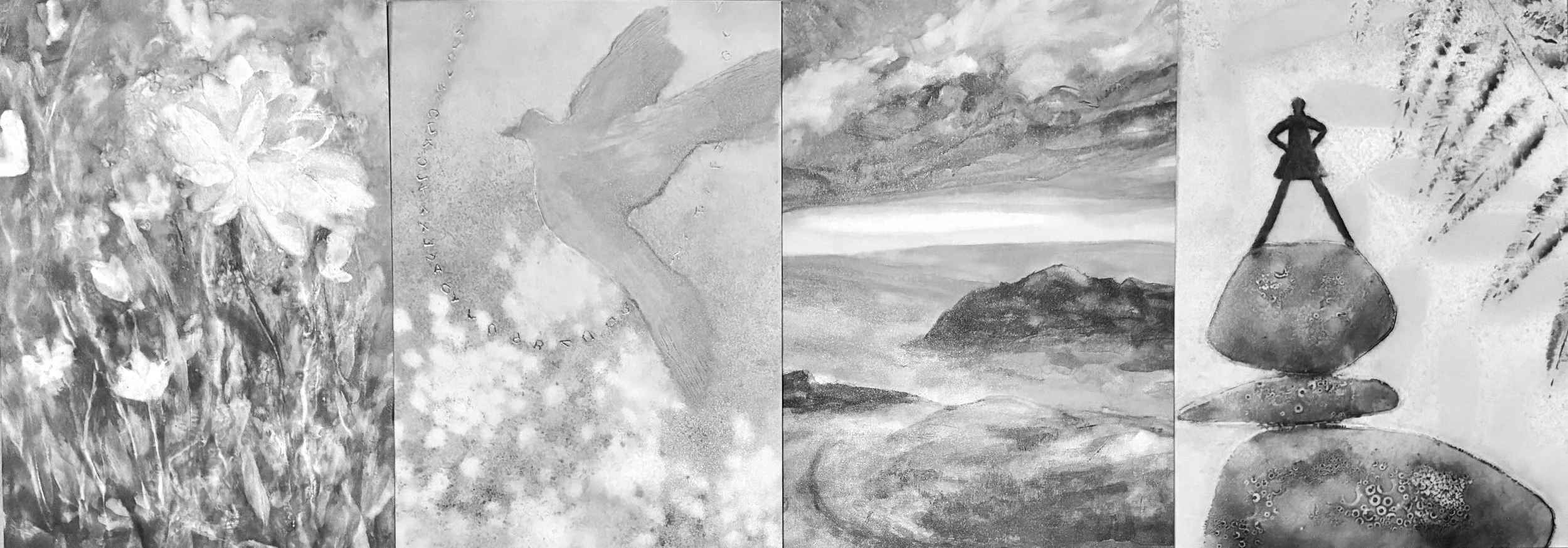
High contrast feels bold and energetic; a narrow range feels quiet. Both are valid, but they should be a choice rather than an accident.
Try this next
Before your next painting, pick one dark that is darker than you think you need, and one light that is lighter than feels comfortable. Place them deliberately, then step back and squint. Notice how the mid-tones start to organize themselves around those anchors. You don’t need to abandon your subtle passages. You only need to give them something to play against.
Getting out of the mid-tone trap isn’t about painting more dramatically. It’s about giving your painting a full voice.
Please note: I may receive some compensation from the affiliate links above, but I only share products that are useful to me and might benefit you.